
1. What is the Hockey Stick Chart?
A hockey stick chart is a line chart that represents growth that suddenly accelerates after a brief time of stability. It represents the data contained in the pattern that has a tip, an inflection, and a long shaft which makes the shape of a hockey stick.
Because of its distinctive pattern of data visualization that resembles a hockey stick the chart is known as a "hockey stick chart".
Investors use this graph to estimate a company's performance and growth, which includes revenue and sales over time as these elements affect the share price.
Hockey stick charts are also used in a variety of other disciplines, including scientific research, environmental studies, statistical research, and more to evaluate the dramatic shift or sudden growth.
2. Concept of Hockey Stick Chart
The hockey stick chart became popular in late 1990 when a study on the past temperature of the world was conducted by Michael Mann and two colleagues, Bradley and Hughes.
The data which was collected from the findings was portraying the shape of a hockey stick with a tip, infection point and shaft in the chart.
The reports contained data from 500 years when the thermometer was not used to measure temperature. This study became very well-known and was even mentioned in the third assessment report in 2001.
Even though this chart was sufficiently well-liked, many experts did not agree with it, which sparked a discussion about the hockey stick chart's geometrical composition. However, numerous further studies came to validate the chart afterwards, and since then, it has been used in a variety of fields.
This chart is used in environmental studies to track changes in the level of poverty. It helps in the scientific field to study the data related to global warming.
This chart in finance helps to demonstrate how a firm's revenue and growth through time affected the share price of that company.
The chart displays the data as brief periods of low-level activity, followed by an indication of an inflection point and a straight increase with a steep angle at the end.
The changes in the pattern in the hockey stick chart need immediate attention. These patterns represent potential trading opportunities.
This chart shows the rapid growth following a brief time of inactivity, which signifies an increase in the stock price. However, it is crucial to determine whether the alteration is temporary or permanent.
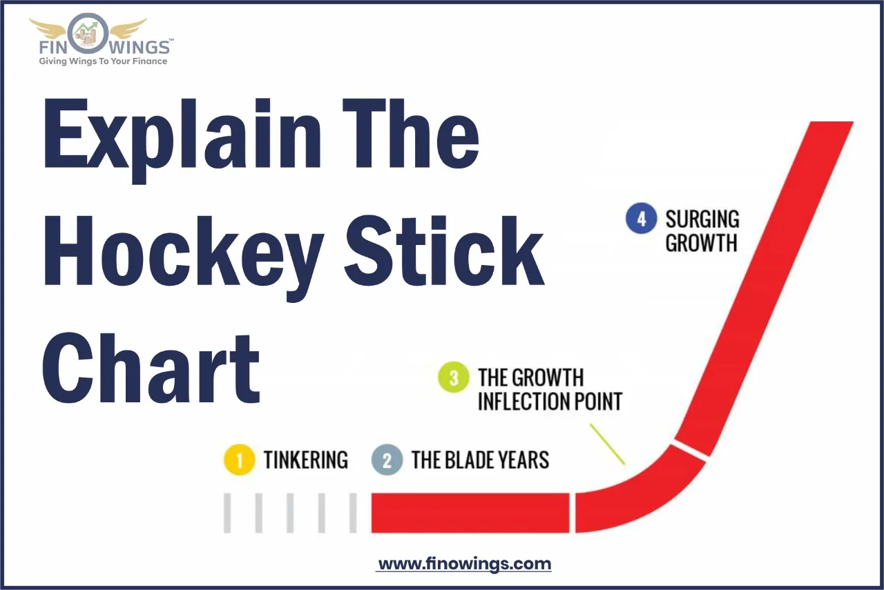
2.2 Stages of Hockey Stick Chart
There are three stages in a hockey stick chart. Let's study them carefully:
|
Stage 1 |
The Blade Years or a Tip |
This situation occurs in the initial period of most companies when they try to establish their business. Usually, the growth of the company is subdued during this period. |
|
Stage 2 |
The Inflection Point |
This stage happens when the company starts generating revenue and its growth rising in the upward direction. This upward development curves into a shape resembling a hockey stick. |
|
Stage 3 |
The Long Shaft or the Surging Stage |
The growth starts to show in long shafts or a straight diagonal line at this stage, which comes after the inflection point. However, after a while, this abrupt surge wears off, and the chart resumes its linear growth. |

3. Example of Hockey Stick Chart
The data from the two organizations Netflix and Groupon, Inc. are used to demonstrate the hockey stick chart in the best possible light.
-
When Netflix first implemented its subscription business model, the firm saw growth that resembled a hockey stick. The company's blade years were from 1997 to 2000, and the year 2000 marked an inflection point when its revenue surpassed $ 41 million. The company reached its surging stage in 2001 when it nearly reached 500,000 subscribers and also had its initial public offering at a price of $15 per share.
-
On the other hand, Groupon began to experience its hockey-stick growth after 2007. The business went through blade years in 2008–2009. The company hit the inflection point in 2010 with estimated revenue of approximately $ 312.9 million; the company then had a surging stage in 2011 when Groupon's revenue reached $1.6 billion.
4. The Bottom Line
The hockey stick chart is more frequently used in science labs, but it is also becoming increasingly popular in the trading industry. With the use of a hockey stick chart, investors can track the company's performance and improve their investment choices. A hockey stick chart that is rising in the upper direction shows that a company is expanding rapidly. The share price of that company is directly impacted by this growth. As a result, many investors prefer to look at a company's hockey stick chart to assess its growth and financial statement.


 72.jpg)