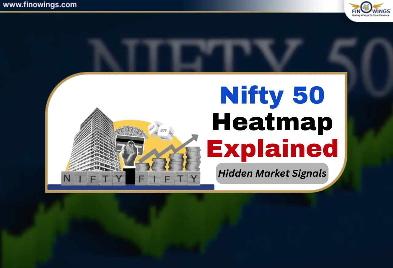
While many investors tend to closely track index levels when analysing the stock market (e.g., Nifty above 24,000 or below 23,000) professional traders and institutions do so to take advantage of the Nifty 50 heatmap index. While most market participants will focus on the index number, they will miss out on the true potential of the index. Market participants often overlook the potential of the Nifty 50 heatmap.
Nifty 50 Heatmap gives investors a visual representation of which stocks are pulling the market down, which are pushing the market up, and if the market increase or decrease is legitimate or artificially inflated. When the Nifty 50 Heatmap is used in conjunction with other investment tools (FII DII data, market breadth and Nifty sector performance), the heatmap provides incredible clarity about stock market sentiment.
The following guide will show you how to:
Understand the key value of a Nifty 50 heatmap.
Uncover latent stock market signals.
Understand how the heatmap is impacted by FII and DII.
Identify how sector rotation foreshadows significant movements.
Understand how retail investors can leverage the heatmap to make informed decisions.
How to Identify Nifty 50 Heatmaps
Nifty 50 heatmap is simply a stock market index (Nifty 50) which shows the 50 Nifty constituent stocks arranged in a matrix and colour-coded based on how the stocks have moved in the last Nifty 50 trading days.
Heatmap Colour Code Explanation
🟢 Dark Green: Strong gains.
🟢 Light Green: Mild gains.
🔴 Dark Red: Sharp fall.
🔴 Light Red: Mild decline.

Block Size Explanation
The size of the blocks that represent each stock corresponds to the equity that that stock has in the Nifty 50 index.
For instance: Reliance, HDFC Bank, ICICI Bank = larger blocks.
Smaller companies = smaller blocks.
The most important observation here is that even when the heatmap is green, the index may not actually be performing well. This is because sometimes just 2 - 3 heavyweight stocks push the index even when other, more numerous stocks are performing poorly.
Why Nifty 50 Heatmap Matters More than Index Levels
Beginners often focus only on one thing: “Is Nifty up or down today?” On the other hand, professionals focus on:
What stocks are driving the index?
Is the index being moved by many stocks or only a few?
What sectors are driving the index?
This is the most important reason why heatmaps are important.
Nifty Index Example
Nifty: +0.8%
Reliance: +3%
HDFC Bank: +2%
30 Other stocks: Red
In this case, the index shows a value of strong but the market value is weak. This is because only a few stocks are bringing the index up.
An Nifty 50 heatmap is what exposes this disparity the best.
What is the Breadth of the Market and How is it Measured Using the Heatmap?
Market breadth analysis involves analysing the number of advancing and declining stocks within the market.
Positive Market Breadth
- The majority of stocks are in the gains (green) category.
- Gains are consistent and spread across the market.
- Stocks in the small and mid-cap segments are also gaining.
Negative Market Breadth
- Very few stocks are in the gains (green) and more stocks are in the losses (red) or flat segments.
- The market is driven by a single large stock.
- Using heatmaps, users are able to see whether the breadth is improving or deteriorating is very important in helping users not to make false breakouts.
How FII DII Data Impacts Heatmap Movements
FII DII data helps with interpreting heatmaps more accurately.
What Happens When FIIs are Buying?
- Banking, IT and energy stocks are gaining (turning green).
- Large blocks take over the heatmap.
- Even with weak breadth, the Index shows strength.
What Happens When DIIs are Buying?
- PSU banks, FMCG, and defensive stocks are gaining.
- The downside losses are contained.
- The heatmap shows a mixture of stocks, but it is stable.
Signals of Risk
- Heavy FII selling is occurring.
- Only the defensive stocks are gaining (turning green).
- Cyclical stocks are in the losses (turn dark red).
Signals to Note:
If Nifty is flat and FIIs are making selling transactions, it means that the DIIs are absorbing the selling pressure, which is a sign of stability, not strength is a temporary indicator.
Performance of Nifty Sectors Illustrated in Heat Maps
Sector rotation is one of the main benefits of using heat maps.
Standard Sector Signals
Banking Green + Others Red→ Index-managed rally.
IT & Pharma Green→ Risk-off sentiment.
Metal, Infra, Realty Green→ Risk-on phase.
FMCG Green During Fall→ Defensive shift.
Sector Rotation Example
Before major rallies:
- First to turn green is capital goods.
- Then metals & PSU banks.
- Midcaps join last.
- Heatmaps often display this rotation 1-2 weeks before news headlines.

Market Sentiment: What the Heatmap Tells Us About Stocks
Heatmaps help show the core emotions that are driving the market.
Fear-Driven Market
- Most stocks show dark red.
- Defensive sectors are less negative.
- FIIs are net selling.
Greed-Driven Market
- Many stocks show dark green.
- Midcaps are outperforming.
- High retail participation.
Confusion Phase
- Display of mixed colours.
- Index is Sideways.
- Volatility is High.
Smart Investors Use Heat Maps To:
Do not buy when the market is extremely optimistic and sell when the market is fearful.
Difference Between Intraday and Long-Term Trader Heatmap Analysis
- Intraday Traders.
- Monitor changes on the hourly heatmap.
- Detect sudden sector triggers.
- Spot index spikes.
Positional and Long-Term Investors
- Examine the daily and weekly heatmaps.
- Recognise zones of accumulation.
- Validate the continuance of a trend.
Investors looking at the long term are better able to remain calm amidst the noise thanks to heatmaps.
What Retail Investors Often Get Wrong
- Evaluating only Nifty positions to judge the strength of the market.
- Overlooking market breadth.
- Failing to consider FII DII statistics.
- Purchasing stocks simply because they have positive returns.
Right Approach:
Nifty + Heatmap + Breadth + FII DII Stats
Using Nifty 50 Heatmap For Smarter Investing
Step-by-Step
1. Analyse the overall colour distribution of the heat map.
2. Examine the movement of heavyweight stocks.
3. Compare with FII DII statistics.
4. Evaluate the participation of different sectors.
5. Validate with market breadth.
If all signs are positive → High probability
If the signs are mixed → Exercise caution

Conclusion: Unique Value of the Nifty 50 Heatmap
Nifty 50 Heatmap is not simply a decorative chart; it is a Market Analyzer. It indicates:
- Robust indexes with accompanying underlying weakness.
- Quiet build-up ahead of new levels.
- Headline-defying sector rotation.
- Authentic market sentiment.
Markets in 2025 and later will be sentiment-driven, volatile, and algorithm-controlled. Investors fixated on indexing will lag the market. Investors focusing on heatmaps, FII DII, market breadth and Nifty sector performance will outperform the crowd.

DISCLAIMER: This blog is NOT any buy or sell recommendation. No investment or trading advice is given. The content is purely for educational and information purposes only. Always consult your eligible financial advisor for investment-related decisions.